Space Shooter UI
There are a lot of ways to handle UI in a space shooter. I present the most common methods here, as well as their advantages and trade-offs.
Edge-Based
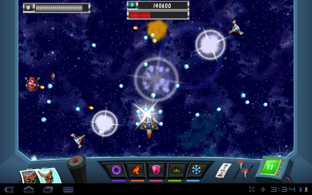
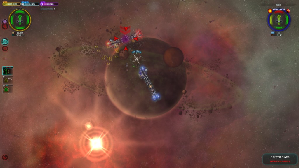
This is where the UI elements are primarily on the edges of the screen:
The main advantage to this approach is a clear separation between gameplay and interface – the UI will never interfere with what is happening in the gameplay area. However, this has many disadvantages from a UX perspective:
- If the player wants to see vital information such as health, he or she must look away from the game action to obtain this information.
- UI updates will detract from gameplay because UI VFX and changes will happen on the edge of the screen.
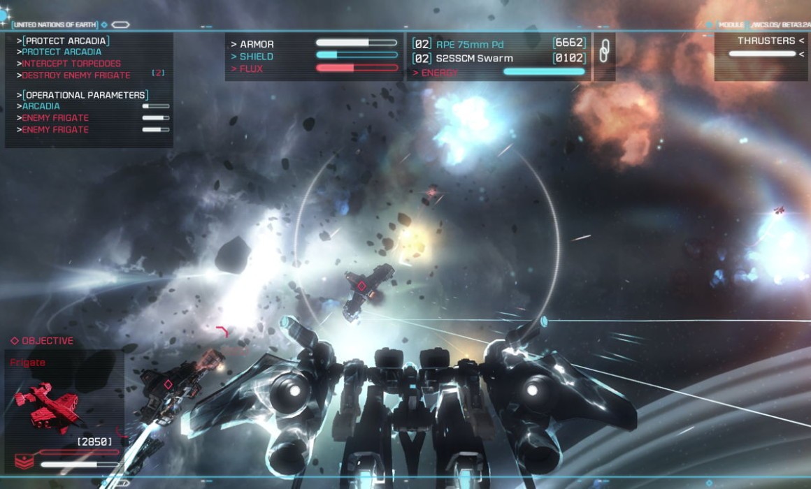
Almost all UI is edge-based to some extent. The following examples will showcase UI that utilizes the edges to separate less important information from immediate data.
HUD-Based
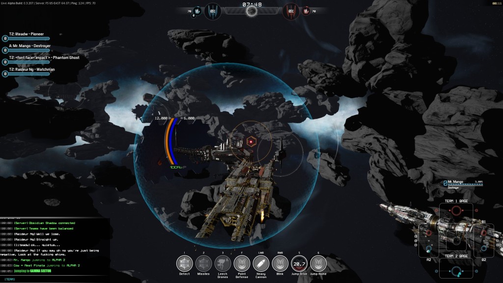
HUD-based may not be the best name for this. I define this type as a UI that is near the center, but not at the center. This is best suited for games where the player’s ship is in the center of the screen. In the above image, the two rounded lines to the left and right of the ship provide vital information such as health and shields.
Surround and Follow Player
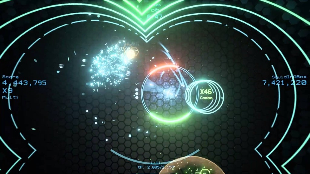
Waves2 is not technically a space shooter, but it is a twinstick shooter that shares gameplay elements with arcade shooters. You can see how the UI follows the player’s character so the player can more easily determine his position based on the larger space taken up by the UI (easier to track in peripheral vision). Less important information such as player score, multiplier, and lives are placed on the edges.
Cursor-Based
SPAZ does a great job of recognizing the player’s eyes will be on the cursor the majority of the time. This means information such as weapon power (shots until cooldown) are displayed on the cursor itself.
The Best UI Provides ‘Easy UX’
The most optimal UI for a game differs depending on the game’s setup, especially how the camera moves in relation to the player. When coming up with a set of rules for UI design, a good rule to follow is the UI should make vital information easy to obtain. The UI should display a conscious understanding of what data is most important from a gameplay perspective and position its elements accordingly.

